Architecture
Built on proven foundations
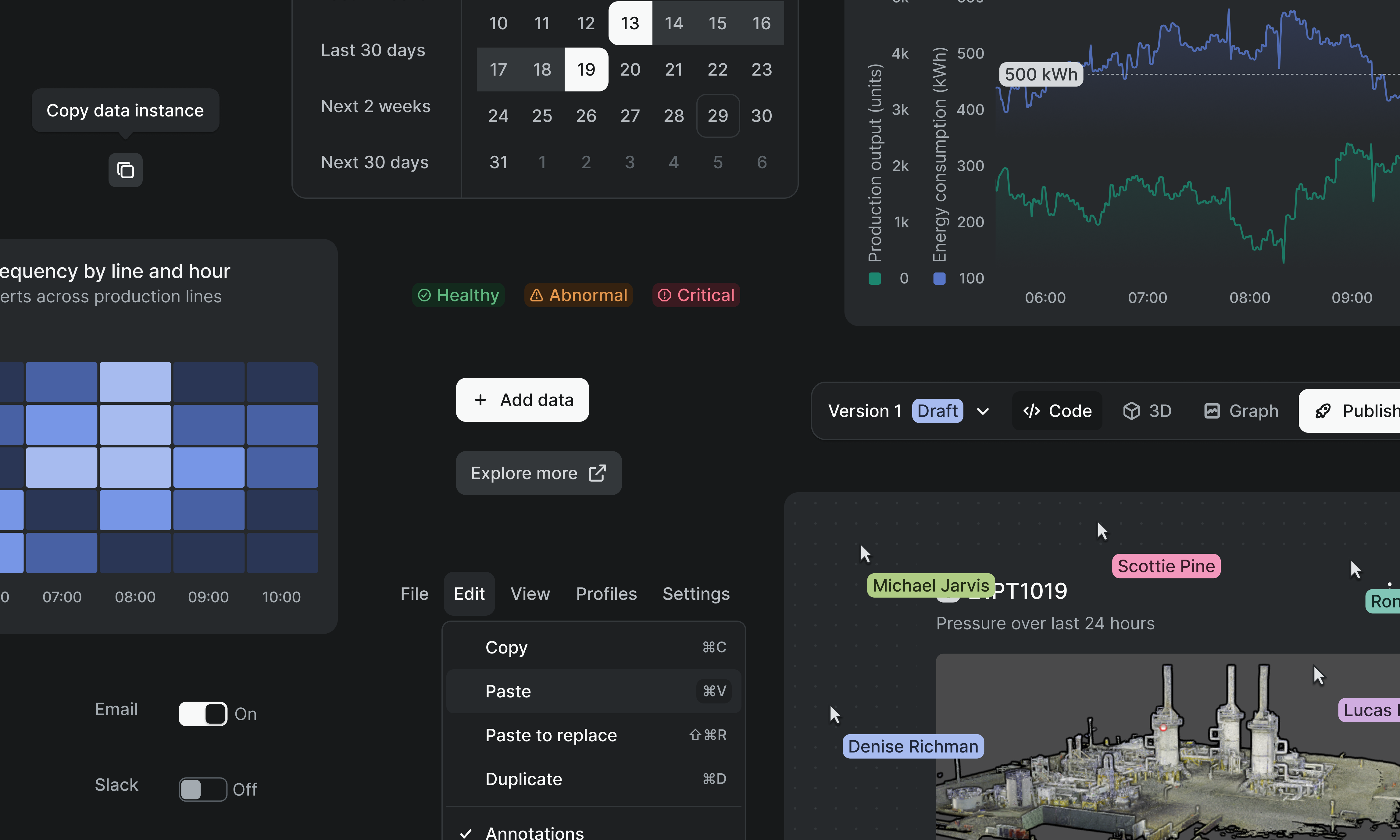
Built on ShadCN and Tailwind with Cognite branding on top—a composable foundation LLMs already understand.
A set of standards calibrated to hazardous, high-stakes environments, built so operators can trust what's on screen under glare, gloves, or pressure. This is how we design and ship software at Cognite.
Built on ShadCN and Tailwind with Cognite branding on top—a composable foundation LLMs already understand.
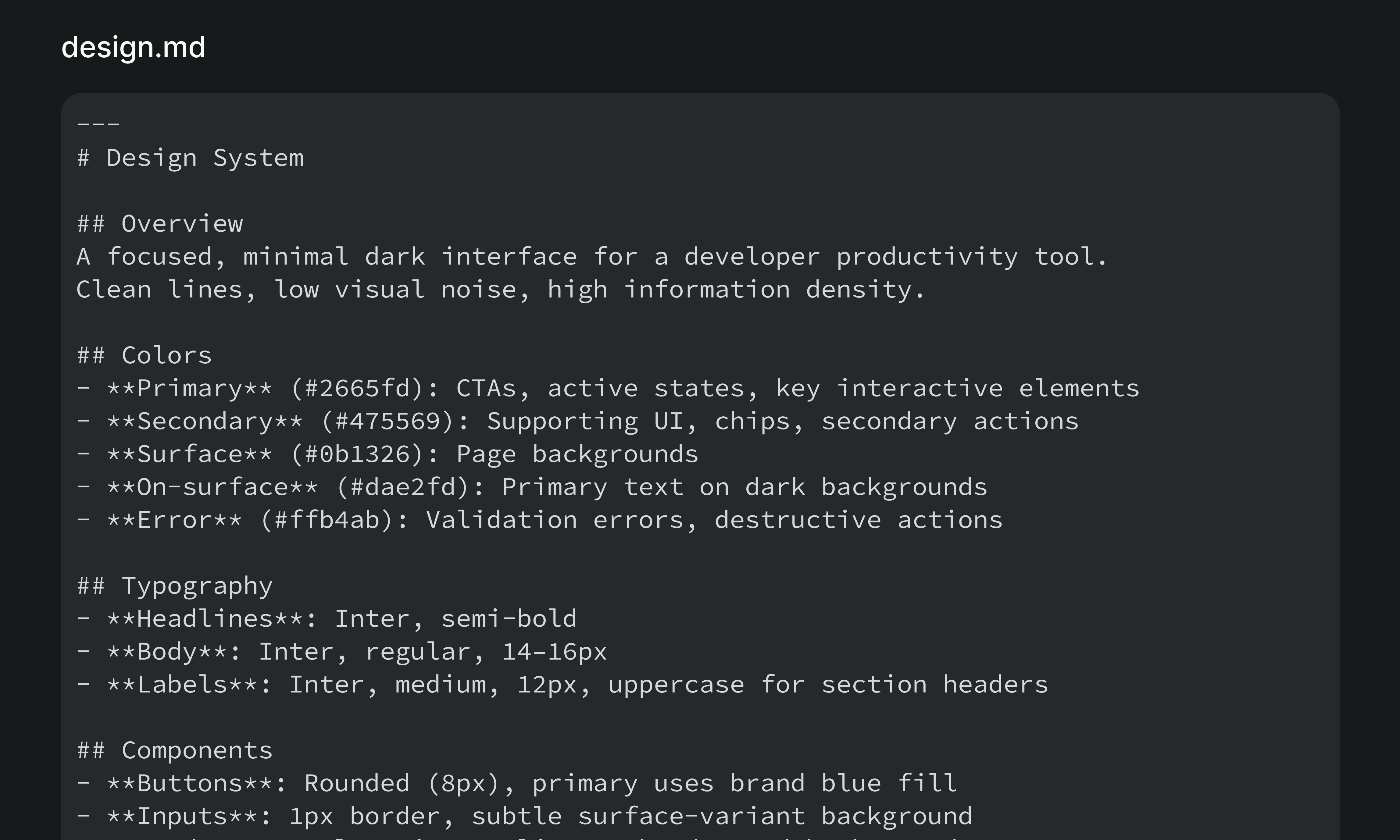
design.md and Aura's tokens read the same way to a designer, an engineer, and an AI agent: one source of intent, not a translation layer.
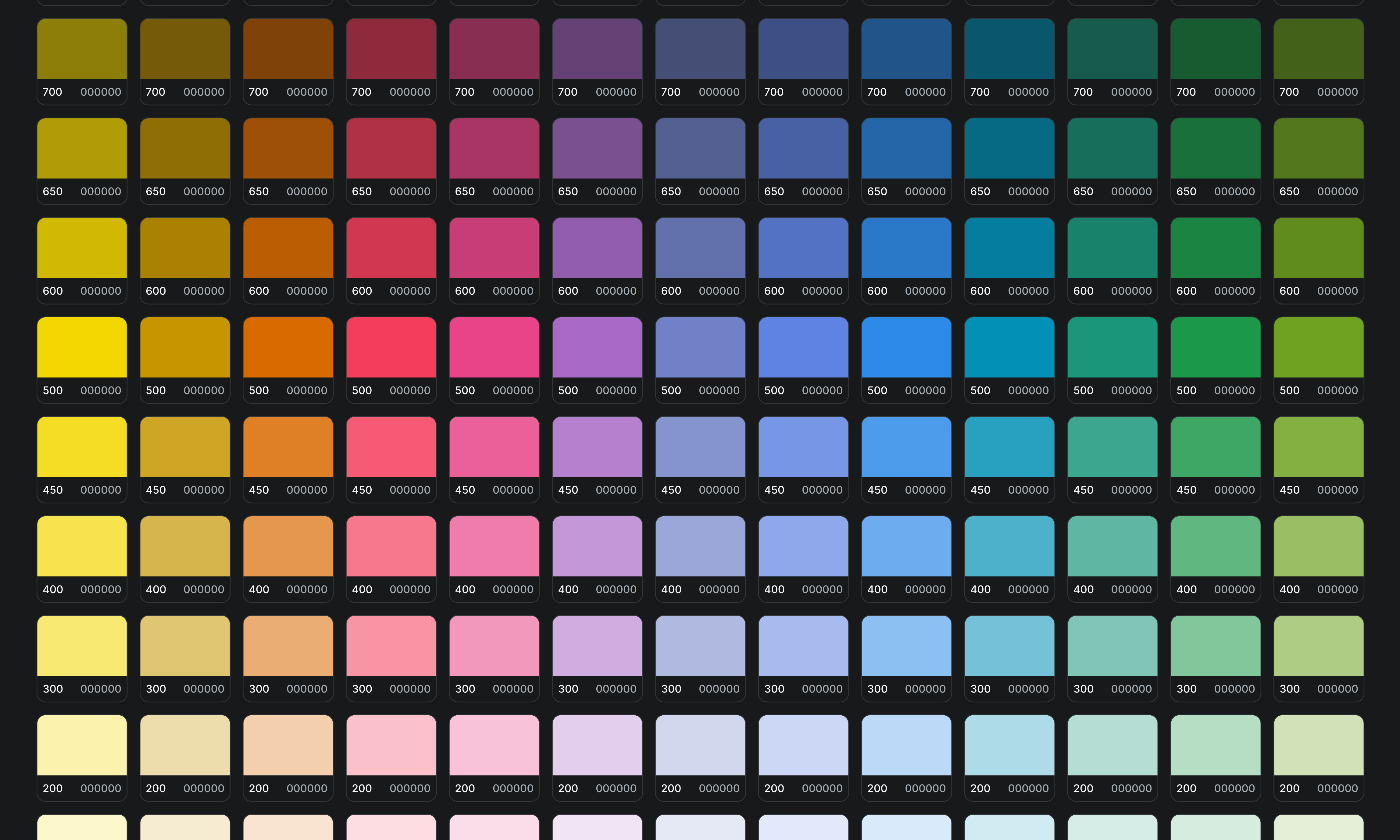
Swap tokens to match your brand. Skills map your palette to our structure with contrast and accessibility built in.
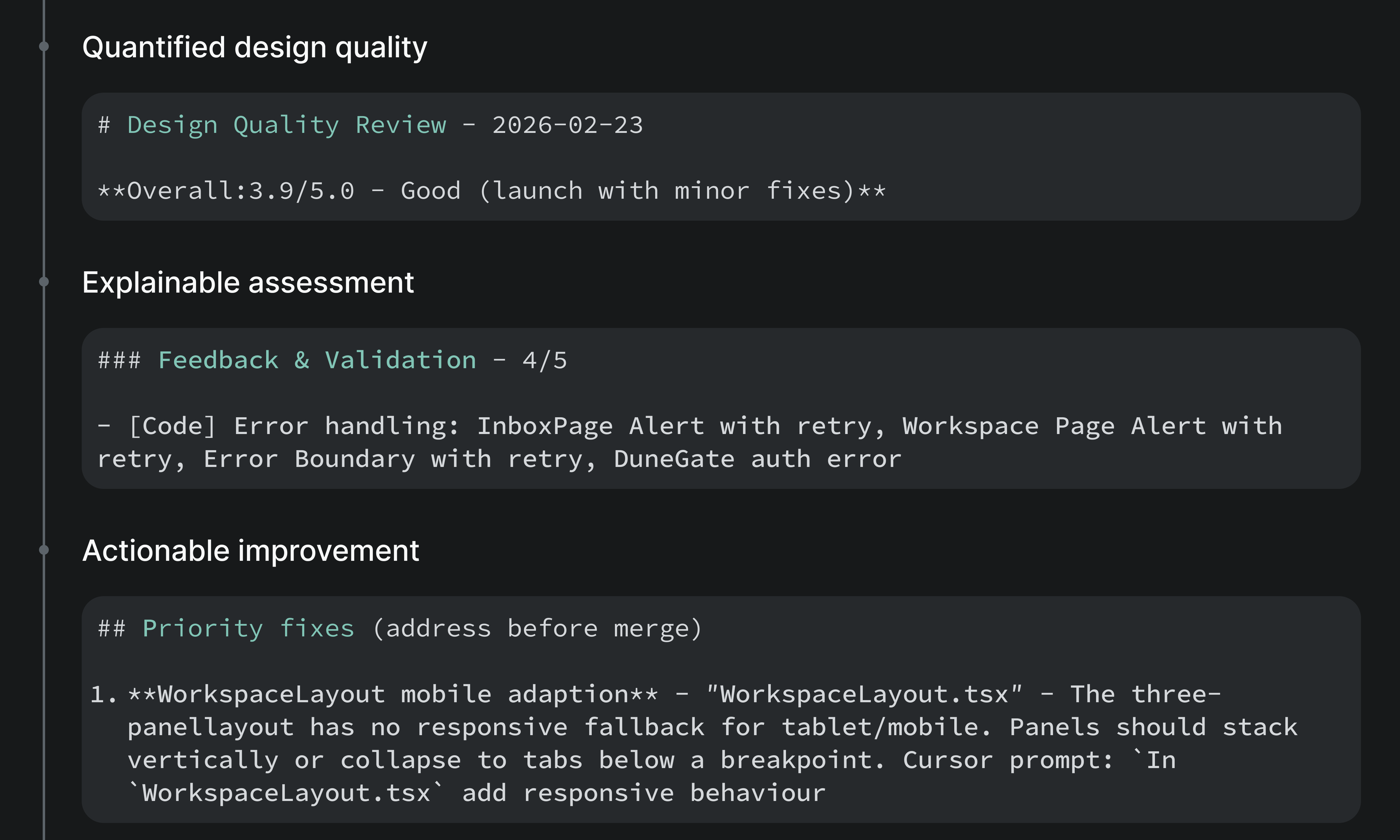
Left alone, agents improvise into visual debt and broken theming. Skills and automated evals catch it earlier, at the point the code gets written.
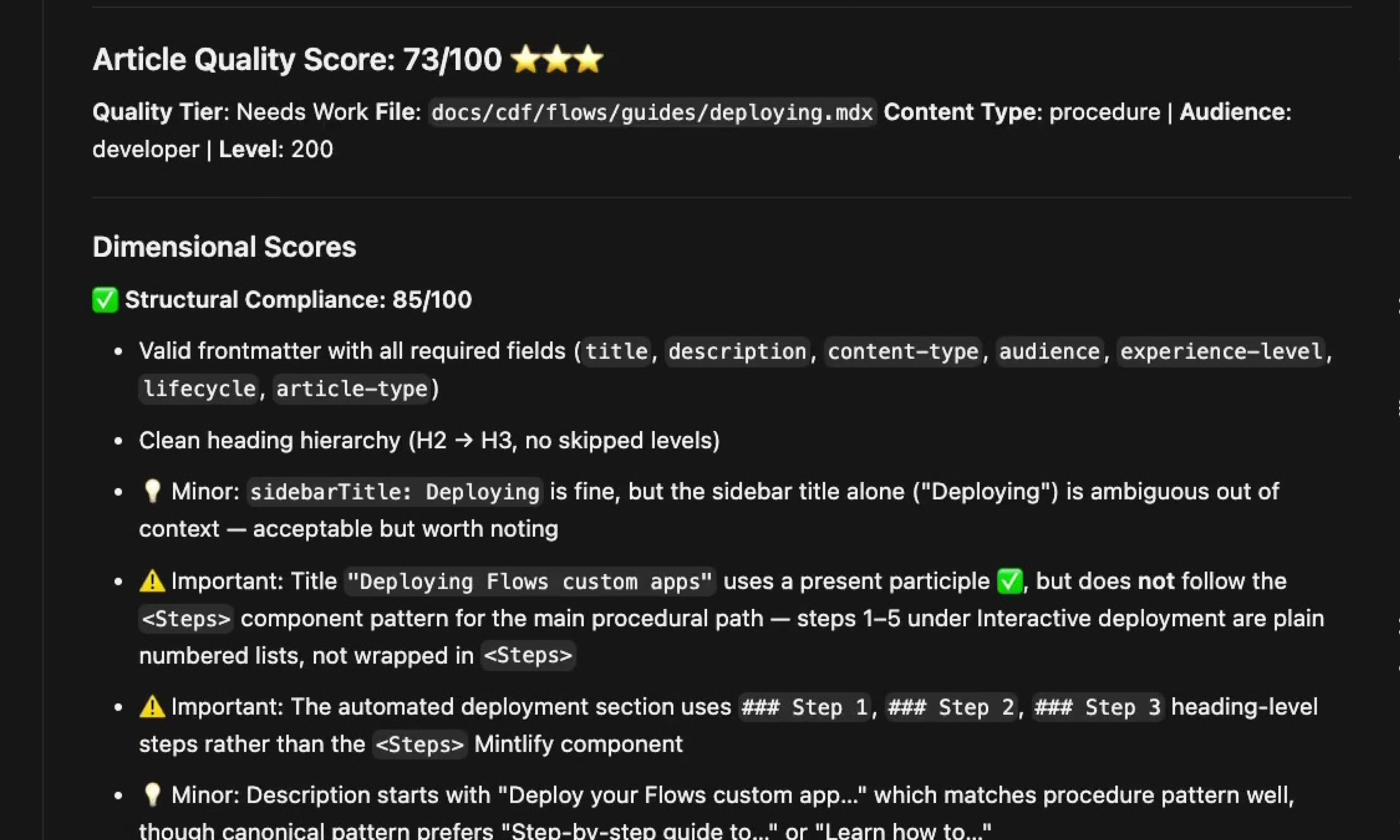
AI-native skills and a shared glossary keep language consistent and on brand across product UI and documentation.
The design.md is a markdown file capturing Aura's design intent. It acts as an index, pointing agents to Storybook examples and skills for pattern and layout implementation based on context.

Every rule, principle, and pattern in design.md is intentionally authored by our design team to capture the design intent behind Aura.

The design.md is structured so AI agents can consume it directly, while the same source powers our external documentation, keeping humans and AI aligned from a single source of truth.

Version-controlled alongside the codebase, the design.md ensures design intent, implementation, and documentation stay synchronized as Aura evolves.

The design.md is portable to new frameworks, mobile, or device-specific builds meaning the system is flexible regardless of framework library needed.
Aura is WCAG AA compliant, so it works whether the screen sits on a wall-mounted display or in a gloved hand at arm's length in direct sunlight.
See the accessibility standards
Status colors and chart lines stay legible under fluorescent lighting and monitor glare.
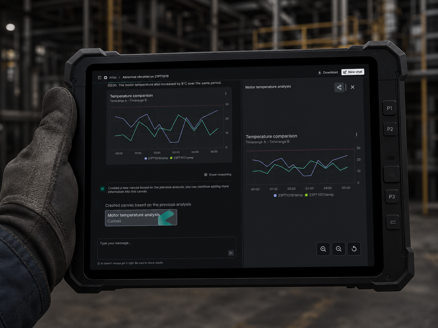
Buttons and controls stay reliable to hit with a gloved hand or in a moving vehicle.
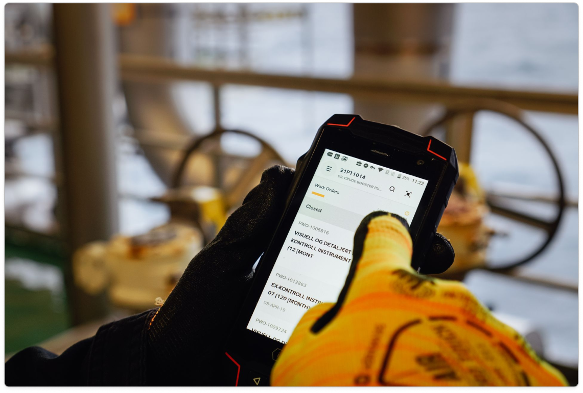
Layouts hold up outdoors, zoomed in for readability in direct sunlight.
Custom glossaries and AI-native quality guardrails keep products and documentation consistent and current in 14+ languages.
Built-in scoring flags AI-translations that need human review before they merge, and checks content quality during the development process.
Planning, writing, and terminology skills support a unified content workflow. A UX writing skill aligns product copy with best practices.
We write for operators, engineers, and planners who keep industry running, and for the people and agents who enable them.
01: Install
Work in Figma, your IDE, or both. Aura fits your workflow, not the other way around.
External teams can spin up their own library and retheme tokens in just a few minutes. From there, pull your Figma mockups straight into code with Figma MCP servers, or skip straight to code and start building with the Aura library installed.
Resources to check out
Aura frees teams from license risk, maintenance burden, and framework lock-in, while cutting the tribal knowledge and QA overhead that slows them down. Every rule lives in code, not in a few people's heads, so the system scales as fast as the team building on it. Less risk, less maintenance, less time re-building the same foundations, more time spent adding value for customers.
Case study
One life science manufacturer skipped the custom build entirely and went straight to Aura for their Flows applications. Re-theming the design library took under an hour. Standing up a new application took under two. Now we're working with the team to bring their remaining 30 sub applications into the fold.
Aura ships by default with every Flows custom app, and Flows custom apps are built for customer production environments. Every app deployed to a customer project goes through certification that scores Aura design system consistency and WCAG AA accessibility as part of a required ten-question review. If you're building a customer-facing surface outside of Flows, install Aura independently with npm add @cognite/aura and the same standards apply.
Checked. Aura usage is a scored line in the automated code review, and Aura design system consistency is the first of ten questions in the design review, both required before certification.
Yes. Override a scoped set of tokens (primary, active, link, ring, decorative) in your app's stylesheet for both light and dark mode, and every Aura component picks up the new theme automatically. Semantic tokens like error and warning stay as-is because they're pre-tested for accessibility.
Extend Aura primitives instead of writing raw HTML and CSS. If it's a real gap rather than a one-off need, raise it with the Aura team so the fix becomes a token or component everyone gets, not a local workaround.